As journalists, it’s not every day we see the words we put on paper come to life. After the printing company prints our papers, that story is done, and we move onto the next. Art on the other hand, is the opposite. When an artist makes their piece, it holds significance for quite some time, possibly forever. But what happens when the two collide — when art and journalism come together to form a secret third thing?
UC San Diego professor Dino Dinco asked his VIS 175 Editing – Theory and Practice class to do this “secret third thing,” and they were up to the task. Their creativity resulted in “Cut-up The Guardian,” a one-day installation featuring experimental cut-up texts. You might be thinking, what does cutting up a newspaper have to do with editing films? Dinco explained the parallels between the assignment and analog film editing when physical film reels were cut with blades and reconnected with tape.
“I was thinking of an assignment that would get students thinking about a different way that we create meaning when assembling a story,” Dinco said. “I like the experimental mechanism of the cut-up method as a way a text could achieve coherence or incoherence based on chance.”
The Cut-Up method was started by poet Tristan Tzara in the 1920s and was popularized by William S. Burroughs in the ’50s and ’60s. What makes this installation so unique to UCSD is that they did this method with The UCSD Guardian’s first issue of the winter quarter. Dinco asked Editor-in-Chief Raymond Tran for 30 copies of the issue for the project. Then, his class got to work.
When asked why he chose The Guardian, Dinco answered, “I was thinking of a source that was accessible to everyone [in the class]. I wanted to emulate editing the same footage.”
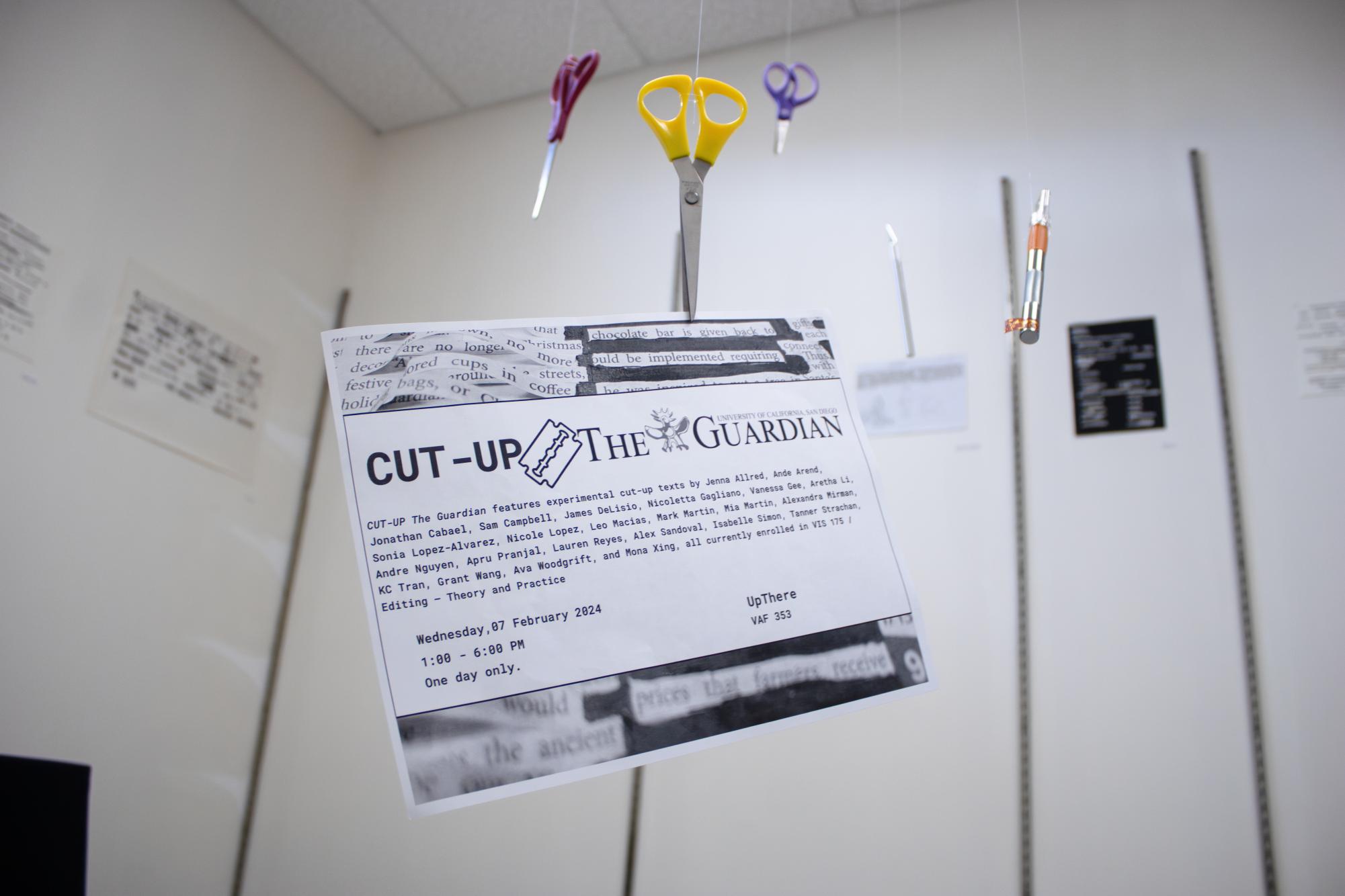
On Feb. 7, the installation opened at UpThere, a temporary exhibition space in the UCSD Visual Arts Facility. When you first walk in, a centerpiece immediately catches your eye. Scissors and blades dangle from the ceiling, with one pair of scissors precariously holding a flier for the show. It shows the tools used to create the show. The room holds all 24 different interpretations of the newspaper, each unique in their own right.
Many used canvases, printer paper, lined paper, construction paper, and even the newspaper itself as backdrops for their creations. The artists repurpose our words from the newspaper to create new stories, like Ande Arend who used the words to create five poems based on the five stages of grief.
“Each poem is a stage of grief as each person realizes that the one they love isn’t coming back,” Arend said. “Finding the words took a long time. I wanted it to feel like an actual poem and not choppy.”
While Arend was writing about grief, others took different approaches to the project. Nicoletta Gagliano incorporated sketches in hers, and Leo Macias created a Joker portrait out of his paper. Macias used big bold letters to have phrases like “HA HA” and titles like “Who Will Have the Last Laugh” to make his words stand out. He also used color portions of the newspaper to put green hair and red lips on a picture.
Alexandra Mirman used a unique technique for her project. She added a 3D aspect, gluing strips of text on the ends so that they pop up from the paper. She also highlighted the word “cut” through the piece in pink color.
“The 3D effect looks way cooler and makes it pop,” Mirman said. “I wanted to show that I didn’t cut out each line one by one and instead cut them all most of the way, the way you would make pretend grass in elementary school…”
James Delisio told a poetic story in his piece, using many words from throughout the paper to put together his poem. He also took a different approach to putting it together.
“I chipped away at it over multiple days, leaving the newspaper and my materials on our living room table,” Delisio said. “I often invited [roommates and guests] to contribute a few words or lines to the final poem. I thought this might be a little chaotic, but it actually led to the emergence of some pretty impressive stanzas.”
Words weren’t the only aspects from the newspaper that were used. Students incorporated pictures into their pieces to help tell their stories. Mona Xing, for example, layered images of Harry Styles onto Chappell Roan. Jonathan Cabael pasted images from the Arts & Entertainment section onto the Sports page, overlaying that with sentences.
Lauren Reyes used a scrapbook technique to create her project, using images of Kali Uchis and Chappell Roan that complemented her words about the fun of the arts.
“My favorite part was assembling it all together,” Reyes said. “I felt the most creative putting those down because I’m not particularly good at words, so it was cool to insert some beautiful visuals on the piece to make it look like more than just newspaper cutouts.”
Another element that enhanced the installation was the center table, which not only held two student artworks but was littered with cut-out words and sentences along with pairs of scissors. Above the table was a window covered in sliced-up newspaper. The light shone through the holes, gleaming down on the table filled with its missing parts.
“I could not be happier,” Dinco said when asked what he thought of his students’ work. “I didn’t think about it in advance, but when they read them aloud in class they sounded like ransom notes.”
Dinco’s VIS 175 class exhibited their creativity in this showcase and brought The Guardian’s words to life, something I have never seen before. It goes to show that art and journalism can go hand in hand to create something even better than imagined.
Photo credit Sarah He & Sophie Nourbakhsh


